Revved Up and Ready to Roll!
The Richmond NASCAR and entertainment hotspot, formerly known as Richmond International Raceway, is revving up its brand identity! With a need for speed, the track underwent a rebranding effort, taking the checkered flag and crossing the finish line with a bold new look.
Responsibilities:
Creative Director | Art Director
Original Logo
The first challenge was the lengthy name, “Richmond International Raceway”. After bidding farewell to Formula One races, the name was trimmed down to simply “Richmond Raceway”. The second challenge was the cluttered logo, featuring a grey scripted “R” in the background.
Victory Lap
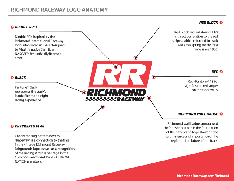
The solution was simple. The cluttered “R” was replaced with a sleek double RR, and the color palette of red and black was introduced. The black symbolizes Richmond’s iconic night racing, and the red signifies the red stripes of the track walls. The checkered flag pattern in the logo pays tribute to the vintage Richmond Raceway Fairgrounds logo and also recognizes the state’s racing history and the loyalty of RICHMOND NATION members.
Ready, Set, Go!
The rebranding effort was a collaborative effort between Madison+Main and Richmond Raceway, with the agency taking great care to preserve the track’s rich legacy in motorsports. “The new Richmond Raceway brand identity represents the bright future of the track while paying homage to its historic legacy,” says Richmond Raceway President Dennis Bickmeier. Get ready to rev your engines and experience the thrill of racing at Richmond Raceway!